
'Prone to Misunderstanding' Logos Reworked
You don't have to be a marketing expert to know what impact a good logo has on people. But some logos are just that bad…

You don't have to be a marketing expert to know what impact a good logo has on people. But some logos are just that bad…
a good one of the logo, you don't have to be a marketing expert to know what impact it has on people. However, some logos are so poorly designed that they can deviate from their purpose. You may even get the impression that it is giving a subliminal message.
An Italian graphic designer named Emanuele Abrate noticed this problem and redesigned the world's most misunderstanding logos. Logos play an important role in creating companies' corporate identities, and Abrate's revamped designs show how a bad logo can disgrace brands. Here are the world's worst logos and their redesigned versions.
1. Instituto de Estudos Orientais

In the logo of the Instituto de Estudos Orientais, a university in Brazil, there is a building representing the religious buildings of Buddhists. pagoda and behind it is a rising sun. More precisely, the logo is designed to give that impression. It can be said that Abrate's design is definitely closer to this meaning.
Abrate, about his design that he exhibited on Behance, “I wanted to keep the concept unchanged, work on the negative space and make the pagoda figure dominant. Also by making the design even clearer and font I chose to convert it to a format that better matches the symbol.” he says.
2. Kudawara Pharmacy
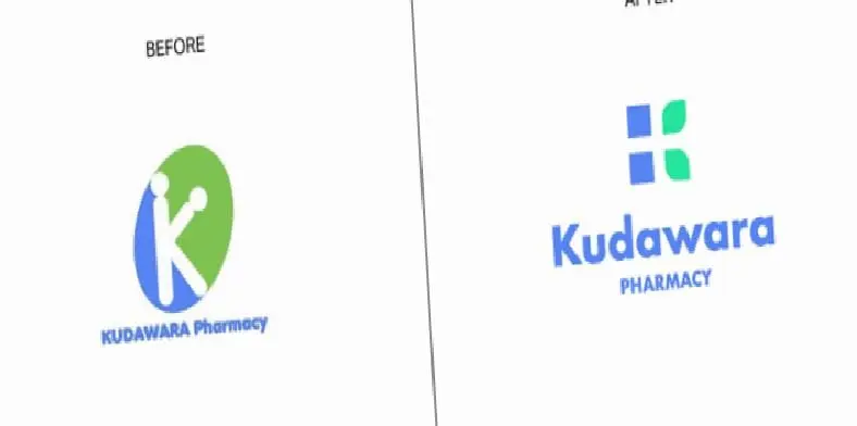
Abrate, emphasizing the letter K for Kudawara Pharmacy and connected to nature designed a new logo that uses simple shapes to give a sense of confidence. He also made changes to the font. The white area in the negative area also represents the (+) sign, which represents a different element in the field of health. We still have nothing to say about the original logo... It seems a little too natural.
3. Fire Prevention Products

What appears in the logo for Fire Prevention Products, a company that makes fire prevention products, is actually fire. More precisely, it should be so. Abrate says that he decided to develop a new concept, inspired by the circular shapes surrounding the flame figure. The new logo is simpler and less evocative, with a circle design surrounding the company's initials.
4. Mama's Baking

Just like at Fire Prevention Products, we see how fire can be misused. Silhouette of a woman in the original logo oven It was imagined as, but lighting the oven doesn't seem like a good idea. Abrate gave up on the oven concept and decided to use an oven mitt instead. The glove also resembles a heart, giving a message of love and passion.
5. The Computer Doctors

The logo of the company, which means Computer Doctors, has a mouse We want to look at it in good faith because it was attempted to be drawn. But the result is truly thought-provoking. The original logo was such a hopeless case that Abrate couldn't salvage anything. The designer created a new concept that combines technology and healthcare, resulting in a more pleasing logo.
6. Clinica Dental San Marcelino

Clinica Dental San Marcelino is actually a dental clinic and its logo has a dentist is treating the patient. It's good in theory, but it seems like it was a bad idea in practice... As soon as Abrate saw it, he immediately decided to change the design and created a face that indicates healthy smiles by taking the initials C and D of Clinica Dental. Designer, “Clean, rounded lines and blue color aim to convey a feeling of confidence and cleanliness.” he explains.
7. Arlington Pediatric Center

Arlington Pediatrics Center represents another one of those tricks our minds play on us. Instead, the designer chose a different version of the same concept and used simple, circular shapes. pictogram He stated that it made it warm and friendly. In fact, the new logo with a hug from the back could also be better. Judging by the previous examples, warmth does not work well for logos. We hope that Emanuele Abrate's designs will inspire these companies and many others.
Every business is unique. Let’s explore how we can tailor these ideas to your own digital project.


